CER Morena Canavesana
Explaining what an energy community is to people who've never heard the term.

The project was handled end to end: brand identity and guidelines, icon set, illustrations, social templates and offline materials, information architecture, UX and UI design, frontend development, backend and database. Content structure and site copy were defined together with the community.
Renewable energy communities have existed in Italian law for a few years now, with incentives attached and new ones forming across the country. Very little of that has been explained in a way an ordinary person can follow.
CER Morena Canavesana covers eleven municipalities in the Canavese area of northern Piedmont. The project started with no logo, no website and no material of any kind. The people it needed to reach are residents, small businesses and local councils, most of whom have come across the term once without ever finding out what it means. The site had to do that job before it could do anything else.
Most energy communities present themselves online in a similar way. They tend to be small sites with little content, and they open on membership details or regulatory framing, which only works for a reader who has already decided to join. Anyone still trying to understand the basic idea has nowhere to start.
The national bodies have a version of the same issue. GSE manages the official registry of energy communities and RSE publishes most of the research behind the model, so between them they hold the authoritative material on the subject. It's accurate and complete, and it's written for people who already know what they're looking for. GSE's search tool functions well as a database and isn't much use as an entry point.
The references worth borrowing from came from outside the sector, from projects where making something understood is treated as the main design problem rather than a finishing touch. That set the direction for CER: a small amount of content, simplified as far as it could go, with custom graphics doing the explaining wherever a drawing works better than a paragraph.
The organisation was new but had already produced a first version of its own logo, and three elements in it were non negotiable: the hills of the Morena Canavesana, a solar panel and the sun. Keeping all three literal elements in one mark had produced something closer to three marks stacked together, so the work was reduction rather than reinvention.
The final mark puts everything inside a single circle. The sun arcs over the top and closes the shape, the hills fill the body, and the panel isn't drawn separately: the grid of the fields functions as the panel pattern, so the two read as one form.
The palette came from a second constraint. The client didn't want green, since almost every organisation in the sector uses the same sustainability green, and avoiding it meant the colour had to carry a different association. The two colours are blue sky and yellow sun, taken from the mark rather than from the category.
The gradient between them runs from yellow to blue across the hills, and green appears in the middle as a transition. The terrain reads correctly without green being in the palette at all, and the same shift is what makes the hills also read as a photovoltaic surface.
Both colours are built into full scales, 50 through 900, with a neutral cool grey alongside. The bright end carries the brand and the dark end handles body text and interface states at accessible contrast, which was a practical requirement on a site meant to be read carefully, often on a phone and often by people who aren't young.
The identity also covers what the community needed to communicate on its own: a custom icon set, custom illustrations, social templates for posts, stories and carousels, and the offline materials. With no internal design capacity, the system had to be usable by people who aren't designers.
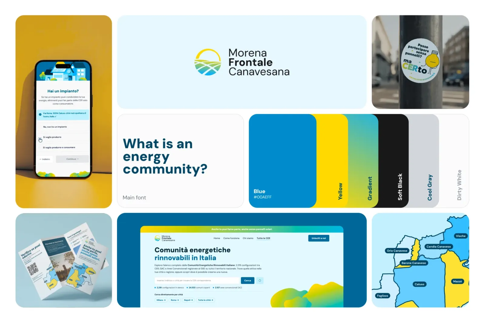
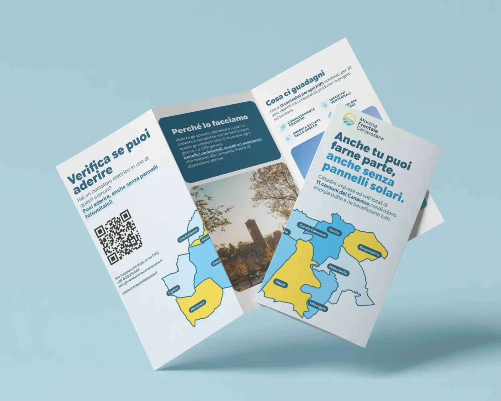
People arrive at the site needing different amounts of information. Some are checking whether they can join at all, others want to know what they would earn, and a few need the regulatory detail before they can take it to a council.
Each page answers one question. The homepage covers whether the community concerns you, Come funziona explains the mechanism, Unisciti alla CER handles the actual decision, and Tutte le CER covers people outside the territory. Keeping the decision on its own page means nobody is asked to commit while still working out what the thing is.
The order within the homepage was the main structural decision. The subject is normally explained mechanism first and eligibility later, and the early version of the page followed that pattern, which put the least relevant information at the top. Eligibility now comes second, with the concrete facts stated immediately: eleven municipalities, one primary substation, free to join, no panels required. The mechanism follows once there's a reason to read it.
Inside each page the approach is consistent. Plain language before terminology, one idea per block, and regulatory detail placed at the end rather than mixed into the explanation. The FAQ holds the technical material, including connection dates, incentive splits and POD rules, which keeps it available without putting it in front of people who don't need it.
During the design phase it became clear that the most useful thing the site could do was answer one specific question straight away: can I take part? The answer depends on which primary substation serves your meter, and finding it otherwise meant leaving the site for the national registry and knowing what to look for once there.
GSE holds the official registry and RSE publishes the mapping behind it. The work was deciding how much of that data was actually needed, taking only the layers required to answer the question and leaving the rest out, so the result stays accurate without becoming unreadable.
The first version sat on the membership page and answered only whether you could join this particular community. It worked, but it handled a negative answer badly: someone arriving curious about energy communities would leave knowing they couldn't join this one, which isn't the same as not being able to join any.
The tool was extended to cover that case, so a negative answer now returns the community that does cover your area. That expanded into a page listing every energy community in Italy, which is useful well outside this territory and also gave the site something to rank for nationally.
Designed and built end to end: UI, prototyping, frontend, backend, database.
Statamic as the CMS, Tailwind on the frontend, SQLite behind the search tool.
AI tools had already been part of the workflow for a while, but this was the first project where they covered the database and the near backend, which are the parts that would normally have gone to someone else. The point wasn't to skip the process but to move through it faster and keep more of the project in one place.
Brand, interface and build all came from the same person, so nothing had to be translated between stages and there was no handover for the design to get lost in.