Stresa Festival
The visual identity for the 65th edition, across print and environmental graphics.

Art direction and visual design: concept, creation of the edition's visual identity, and the direction that followed from it. Production across the different formats was handled together with the Colibrì Vision team.
Stresa Festival is an international music festival on Lake Maggiore, running since 1961. Each edition gets its own visual identity, and this one covers the 2026 programme.
Two things were fixed: the festival logo, and blue accents carried over from the previous edition. The blue had a practical reason to stay, since printed material from the year before was still in circulation and the new pieces had to sit alongside it.
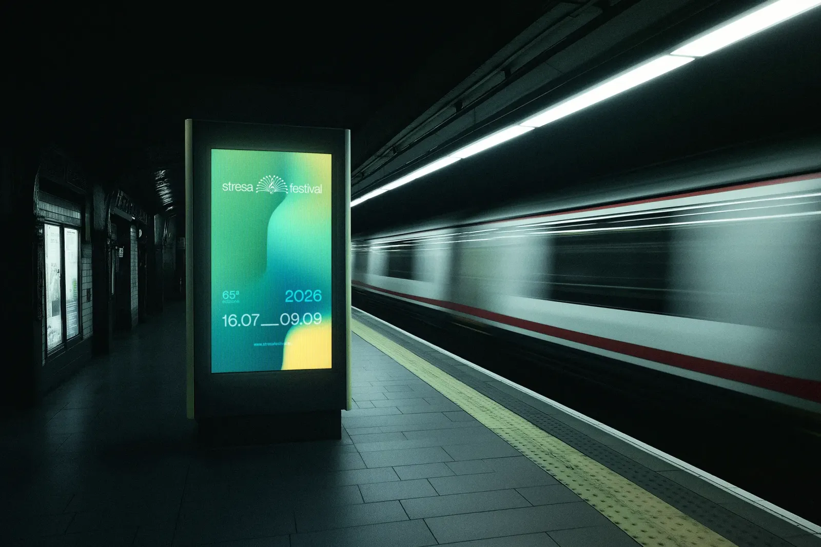
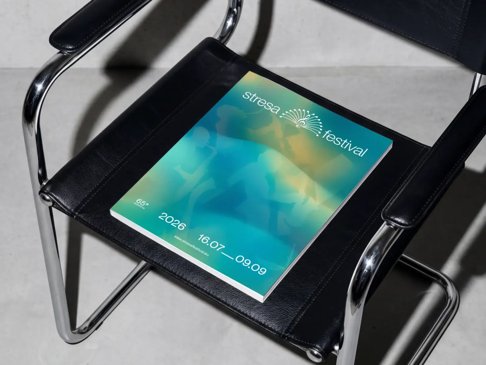
The rest was defined for this edition. The image is a grained texture with a gradient moving through it, forming waves, with the silhouettes of musicians subtracted from the surface. The waves read two ways: as sound coming off the instruments, and as the water of Lake Maggiore, where the festival takes place.
The palette follows from that. Starting from the inherited blue, the colours are the ones a lake already has, sand and water, so the identity stays tied to Stresa rather than to the sector.
The backgrounds come from a randomised wave generator, so every run produces a different movement. Each piece of material carries its own version, all consistent with each other and none identical, which is how water behaves anyway.
Scale is where the image changes. On large formats the gradient and the waves stay, while the subtracted musicians come out: at that size the silhouettes lose legibility and the grain becomes too coarse. Nothing is lost by removing them, because the waves already carry both readings on their own.
The identity runs across everything the festival prints: posters, totems and environmental graphics, roll-ups and wayfinding, the programme book, leaflets and materials for venues and public spaces.